New in EasyAdmin 4: Dark Mode
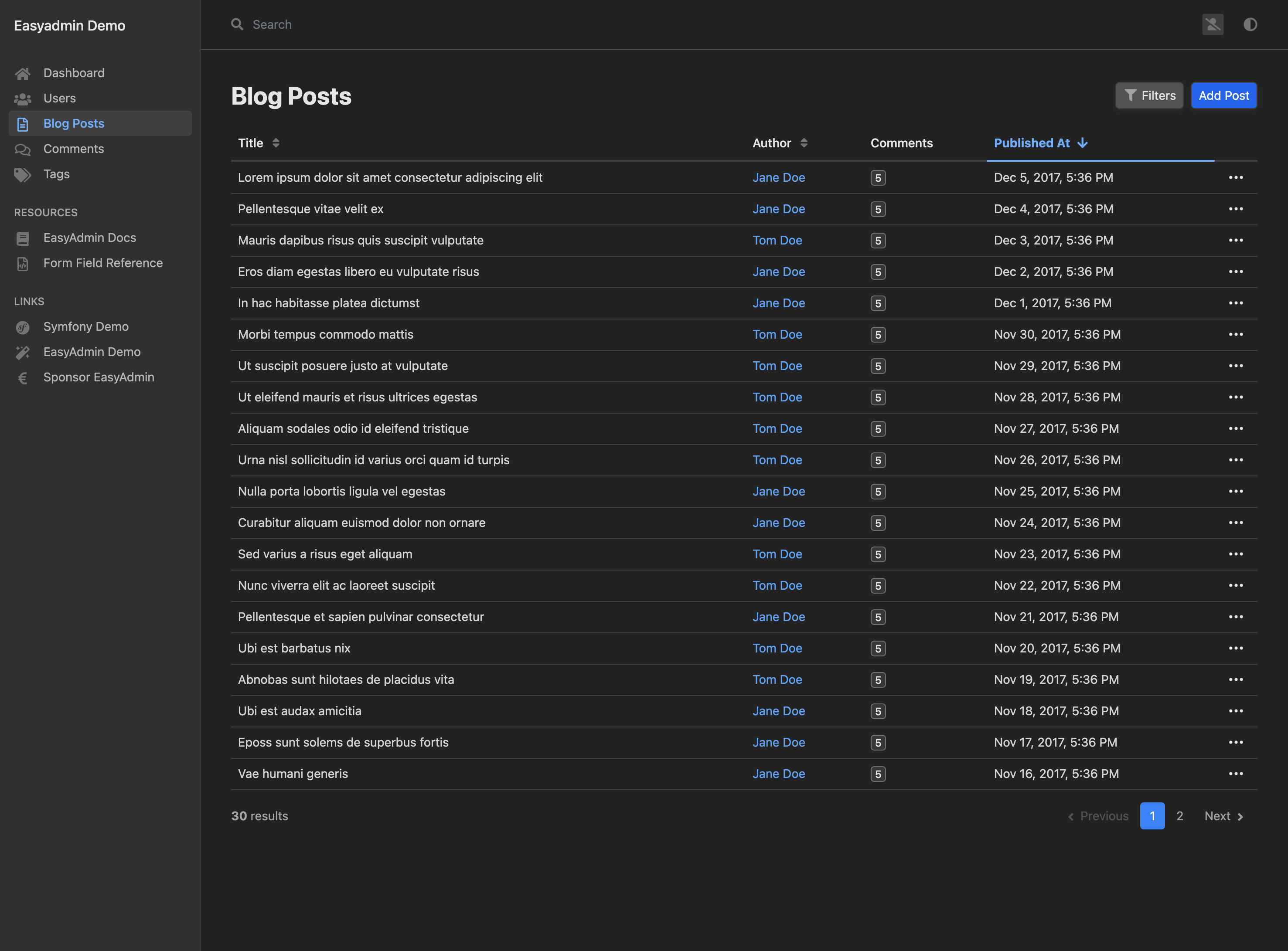
28 Feb 2022EasyAdmin 4.0.7 has been released and its main new feature is a dark mode design that complements the default light design. “Dark mode” uses a dark gray-based color scheme for all interface elements. This makes content stand out, allowing you to focus on your work. This mode is also easy on your eyes, especially in low light environments.
Our intention was to introduce a “dark mode” as soon as possible after EasyAdmin 3 release. That’s why most of our styles use CSS properties (also known as “CSS variables”) since day one, which makes it easier to introduce alternative designs.
Activating the New Dark Mode
You don’t have to change or configure anything in your backend to enable the new “dark mode”. Just upgrade your EasyAdmin version and your users will see the new design:
We based the “dark mode” design on neutral grays (“light mode” is based on bluish grays). This was done to better fit the design of any kind of backend. If you need it, check the EasyAdmin design docs to learn about customizing the default EasyAdmin design.
By default, EasyAdmin uses the same mode (light or dark) as the operating system of the user. EasyAdmin also changes the design automatically to always keep it in sync with the operating system (ideal for those users that change the mode automatically from sunrise to sunset).
If a user prefers to set the mode explicitly, they can use the new mode selector located next to their names:
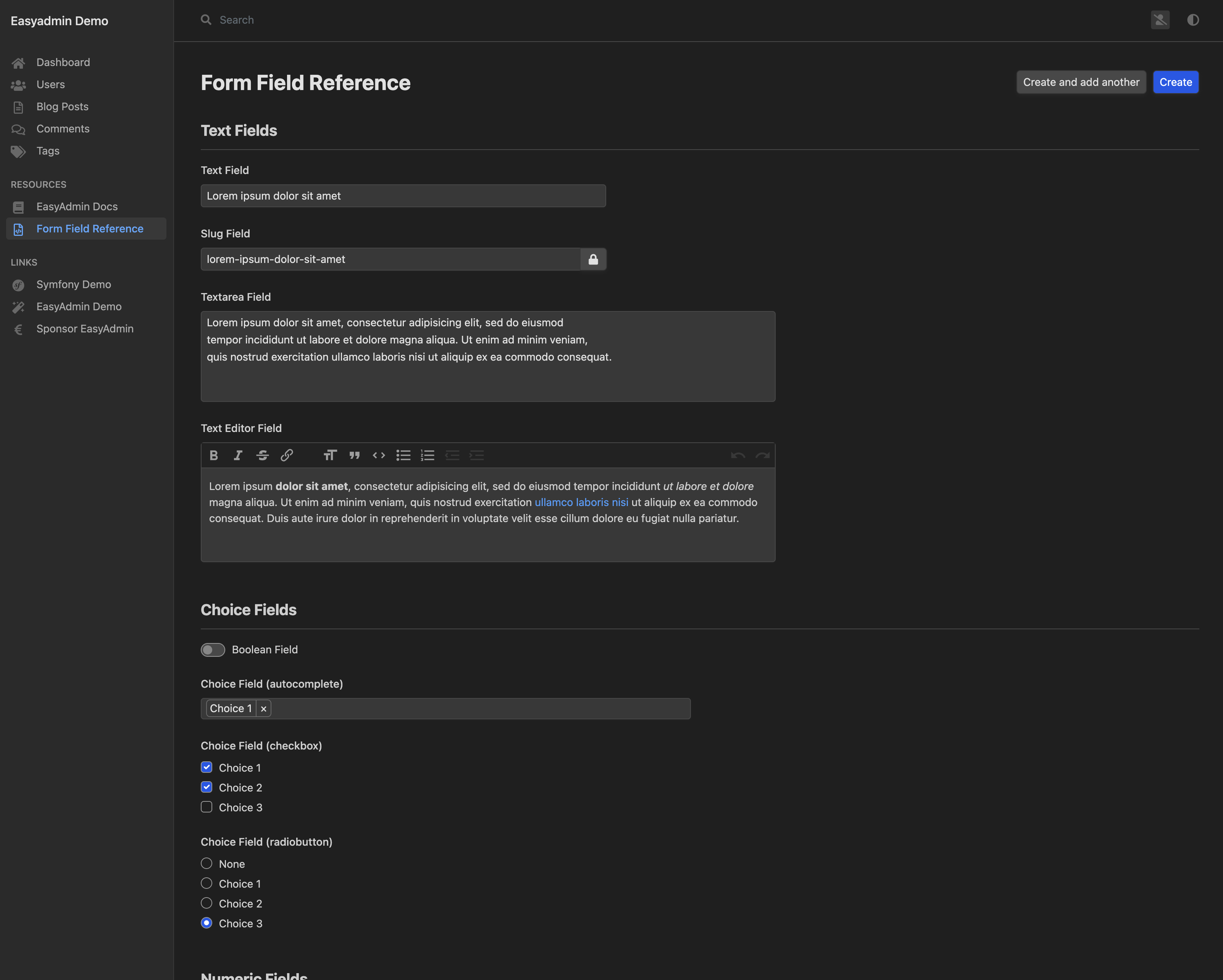
The new dark mode also applies to all form elements of the different EasyAdmin fields:


