Redesigning EasyAdmin
28 Jul 2021EasyAdmin, a popular admin generator for Symfony applications, will soon include a redesigned interface. After tens of hours of silent work, we’re ready to unveil the new look of your backends. But first, why a redesign?
Design is as Important as Code
If you are a hardcore programmer, you might be wondering why waste so much time on redesigning an interface that already works instead of using those resources to fix some of the many unsolved bugs of the project.
The answer is that we, the maintainers of this project, believe that design is as important as code in a project like EasyAdmin. The clients of this project are not only the developers who build backends but also the people who actually use those backends to do their job.
That’s why it’s so important for us to care about the visual design (how things look) and the UX/interaction design (how things work). In fact, design is so important for this project that we’ve had a Design label in our GitHub repository since day one (we believe that if a project truly cares about something (design, security, performance, etc.) it should have a GitHub label for that).
The New Design
The moment has come! Let’s unveil the new design using the EasyAdmin Demo application as the sample project.
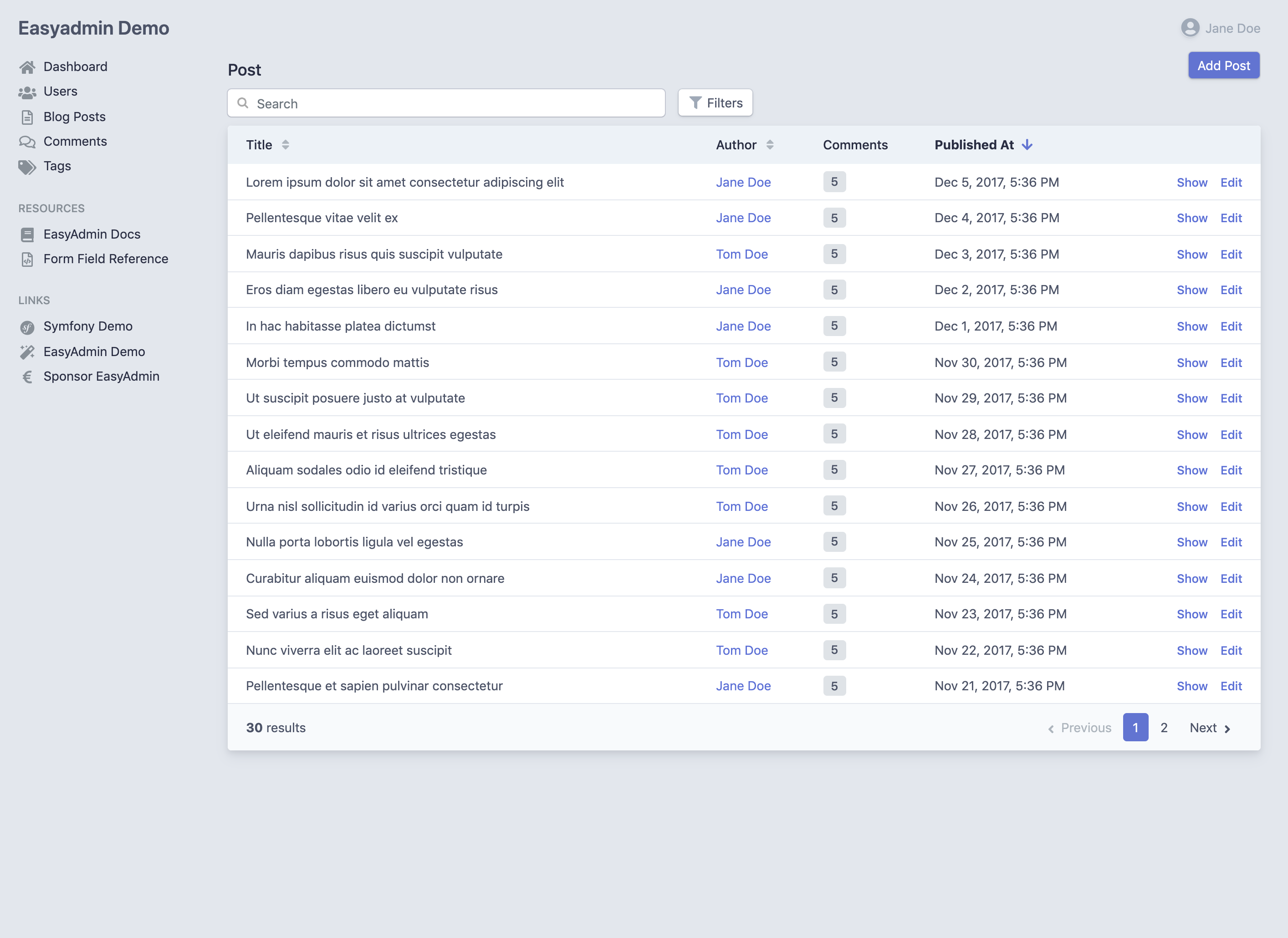
BEFORE: this is the default index page without any customization (click on the image to zoom it)
The main design issues are:
- Using a background color for the entire page makes the entire page look too “blueish” (technically the color is called “indigo”, but it’s a shade of blue). This makes it harder to integrate the backend with your brand design;
- Because of that colored background, information must be wrapped in “boxes”, which makes things harder when you have to nest those “boxes” (this is a problem in the edit/new pages);
- Some of the elements that are not included in those boxes look disconnected from the rest of the page, such as the search field and the action buttons.
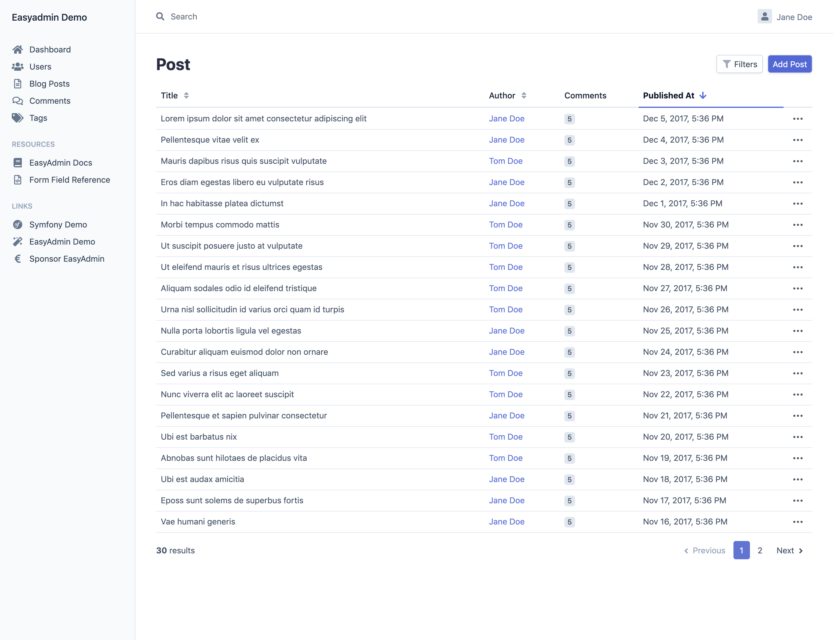
AFTER: this is the same page with the new design (click on the image to zoom it)
The new design fixes all the previous problems:
- Overall design is more neutral, which simplifies the integration with your brand design;
- Some elements have been rearranged (search, filters) and none of them looks “disconnected” any more;
- We’ve added more “breathing space” to important elements, but at the same time the overall design is more compact than before (that’s why we increased the default number of elements of the index page from 15 to 20).
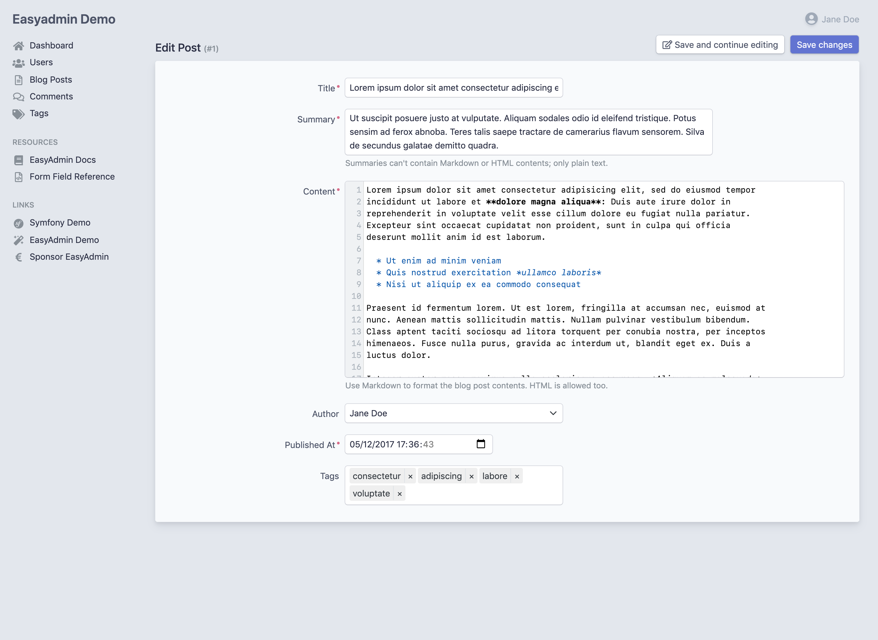
BEFORE: this is the default edit page without any customization (click on the image to zoom it)
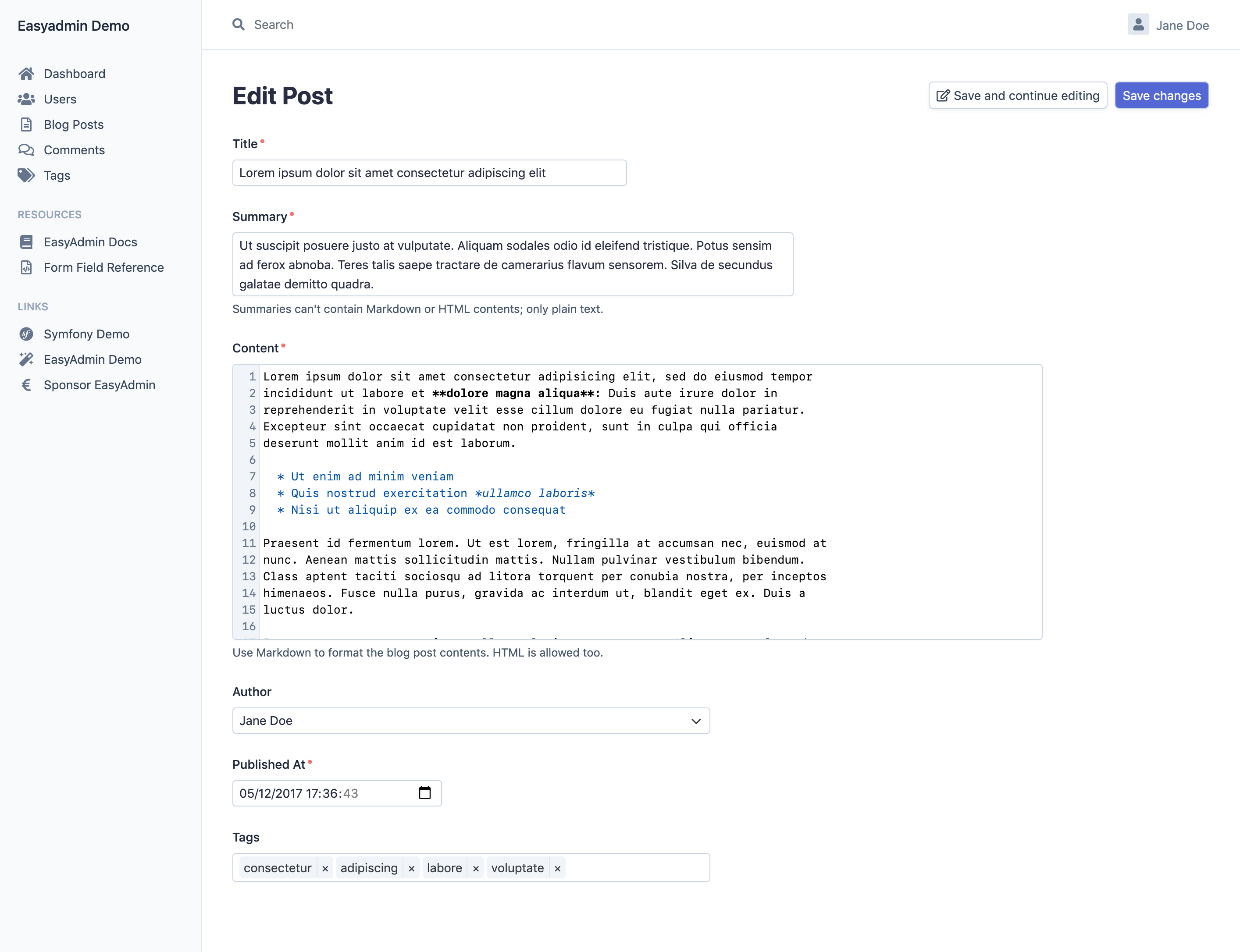
AFTER: this is the same page with the new design (click on the image to zoom it)
Design Inspiration
If you are a customer of Stripe, you probably recognized the new design as something similar to Stripe Dashboard. You are right: we took inspiration from Stripe because we consider their Dashboard the best designed backend. This isn’t something new, because the current EasyAdmin design is also based on the previous Stripe Dashboard design.
However, we didn’t copy their design. Our design contains many more differences than it might seem at first:
- Our icons come from FontAwesome;
- Our color palette comes from the excellent Tailwind CSS 2 Color Palette;
- Our floating menus come from Apple macOS Big Sur menus (with distinctive rounded corners and internal padding);
- Many font sizes, margins and padings differ from the original Stripe design;
- Our design is fully responsive (as shown below).
Design Details
The new design is full of details that you’ll love. See for example the way you can temporarily minimize the sidebar in case you need more space to focus on the main page information:
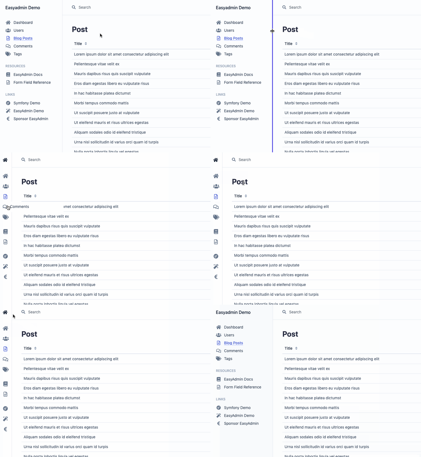
We copied this UX interaction from BitBucket interface and it’s something that Stripe design lacks because their backend is not responsive.
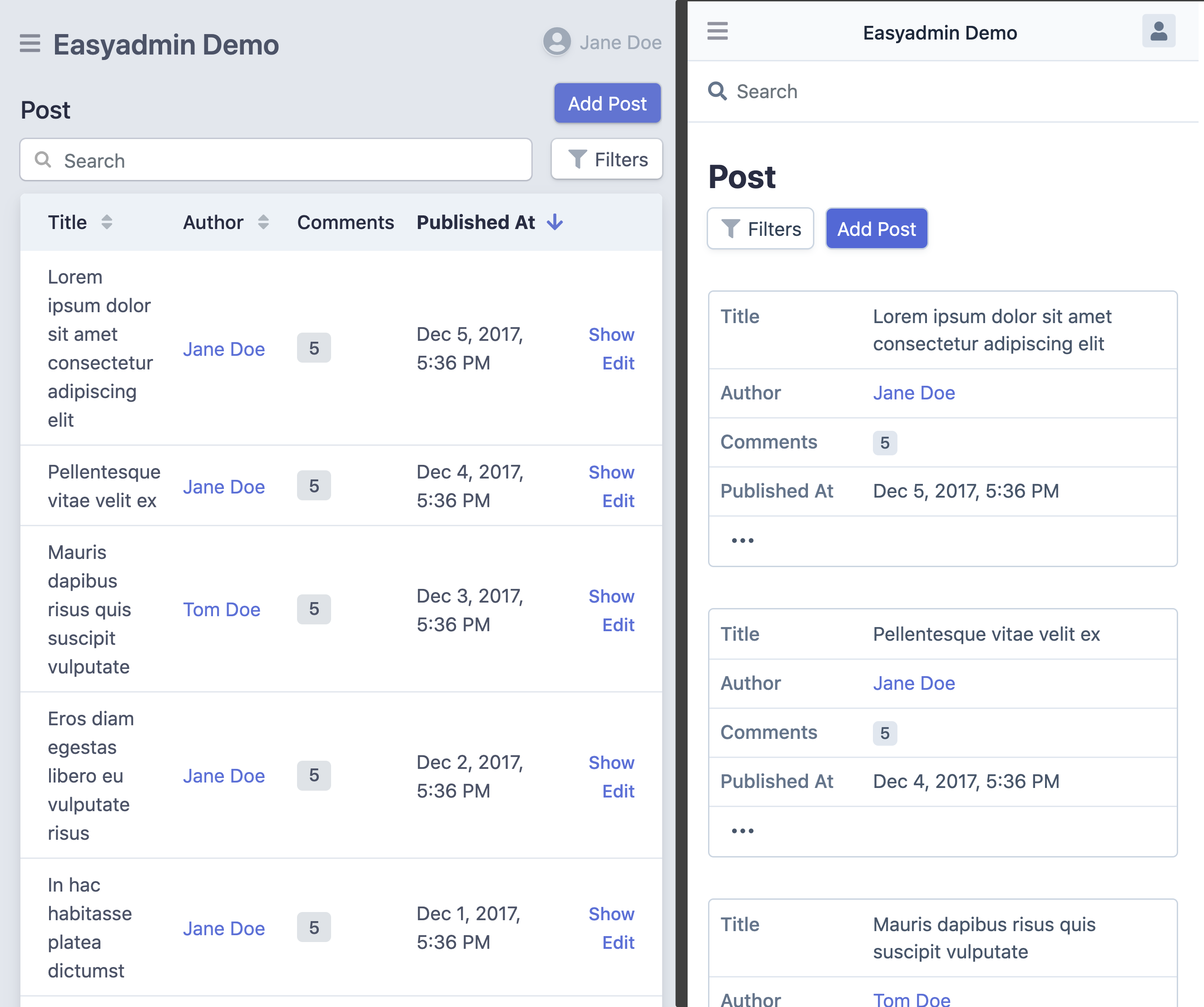
EasyAdmin 3 design was responsive since day one, but there was a lot of room for improvement. See the following comparison between the current design (left) and the new design (right):
The new design turns each table row into a card automatically, to better display the information in small devices.
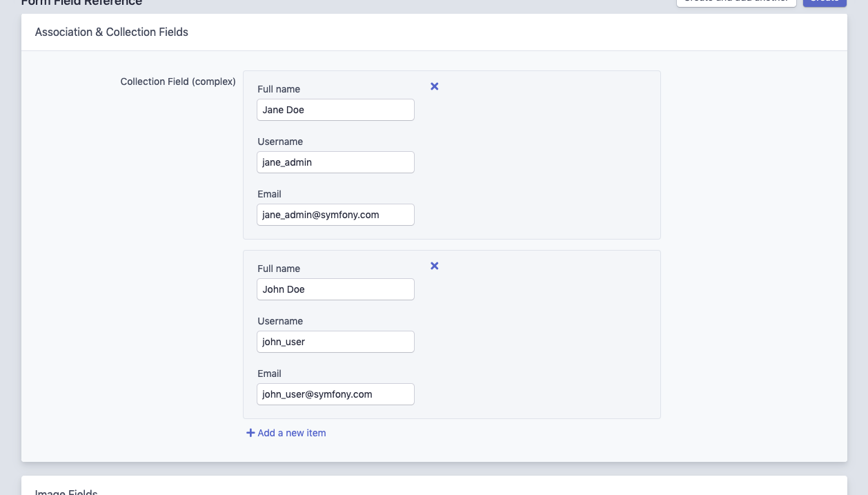
We’ve also redesigned all form fields. The field that improved the most was the collection field, which is a series of one of more subforms. In the current design it looks this bad (here you can clearly see the problem of “boxing” elements that requires the current design):
In the new design, this field is more compact and dynamic, and it doesn’t suffer from any of the design issues of the previous version:
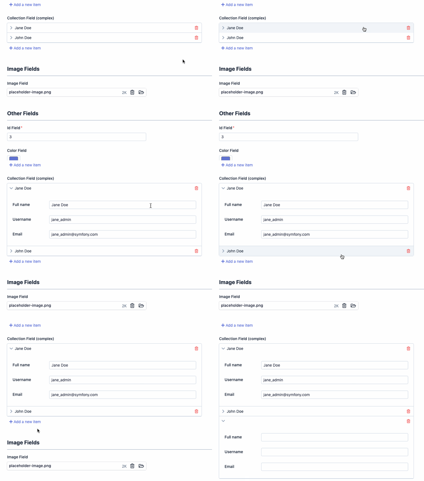
An added bonus of the new design is that form layouts can be more complex because you can render multiple fields on the same how. Read the updated doc to learn about this.
What’s next?
The new design is available as the Pull Request #4500 in the repository, so you can test it right now. We’ll merge it as soon as possible to include it in the next EasyAdmin release.
In most existing EasyAdmin backends, the new design won’t require any change in your application. If you have integrated custom actions or done some advanced changes in your backend templates, you might need to adapt your custom styles a bit. We hope to make this kind of design updates easier in the future.
We’re beyond excited about this new design. It looks fresh and modern, while being much less opinionated and much more flexible than the current design. This starts a new chapter in EasyAdmin history and will allow us to focus on implementing some of the most requested features.
